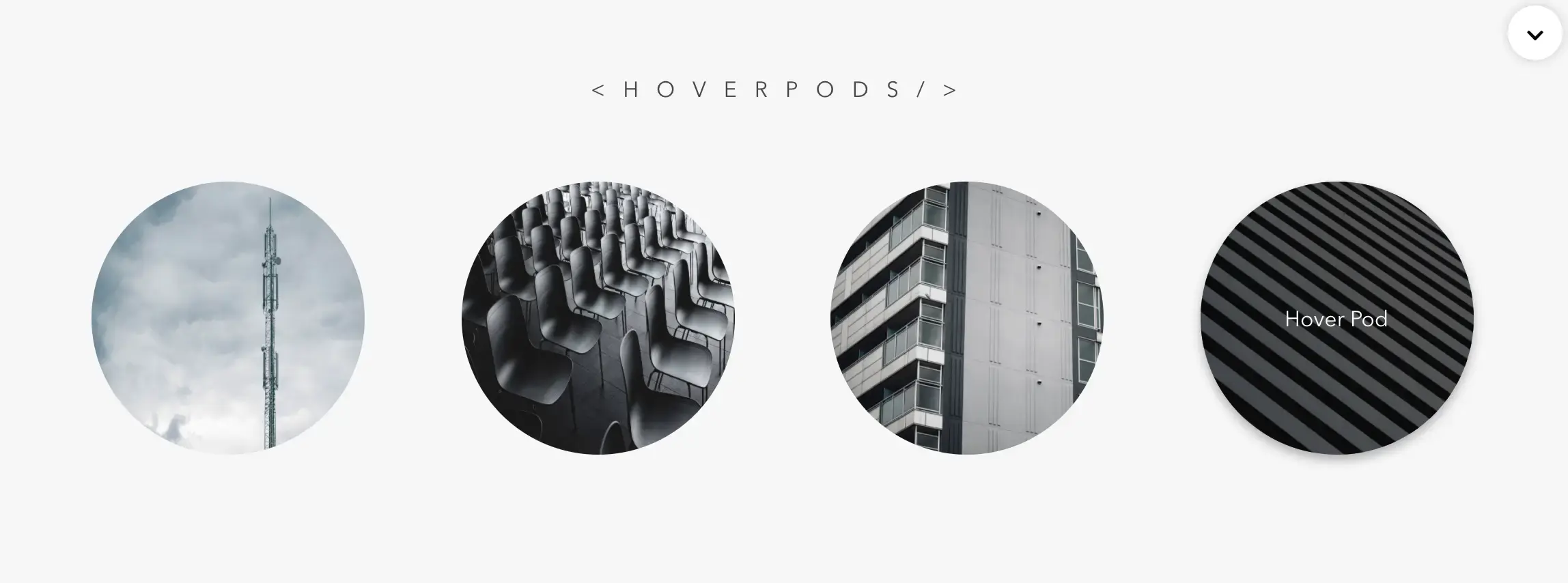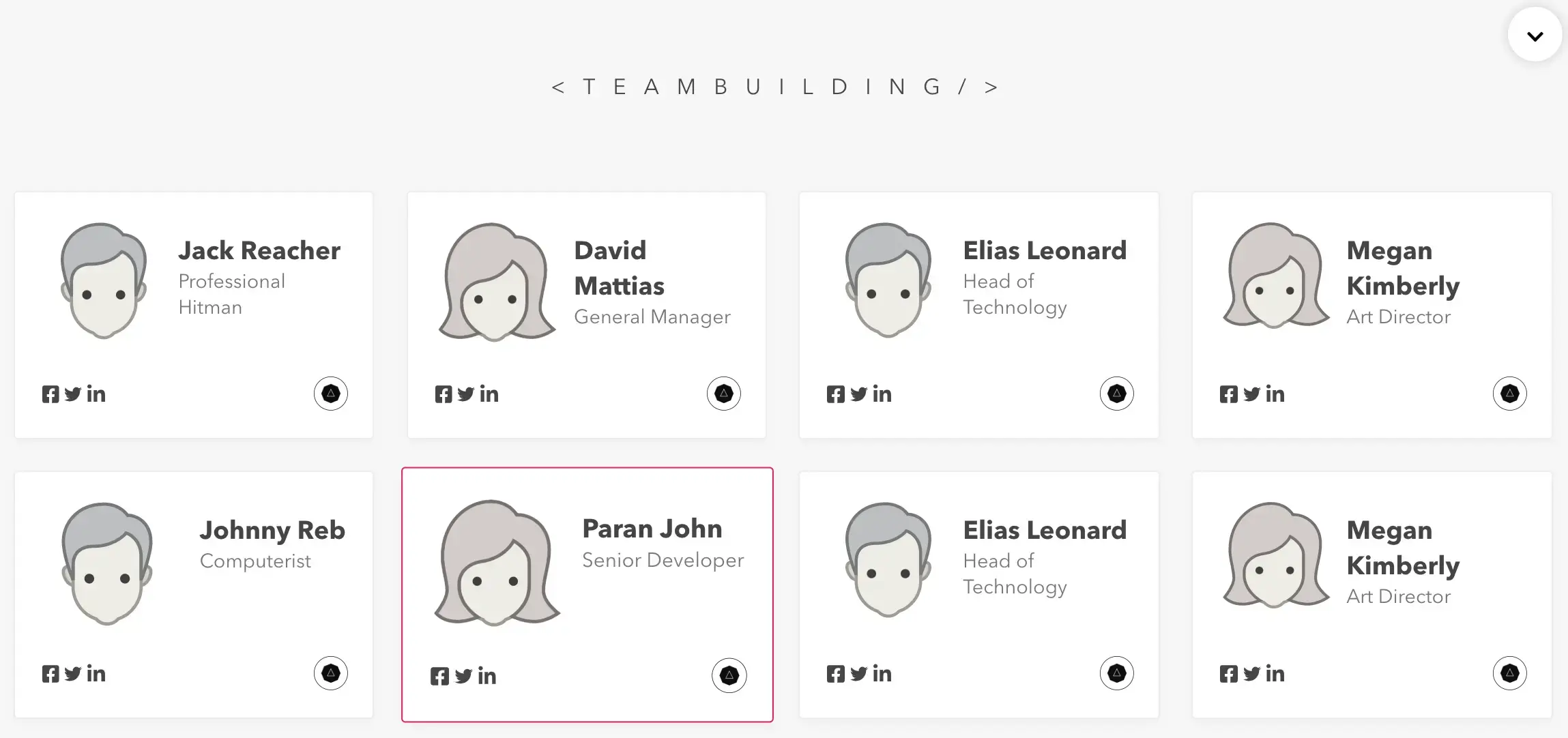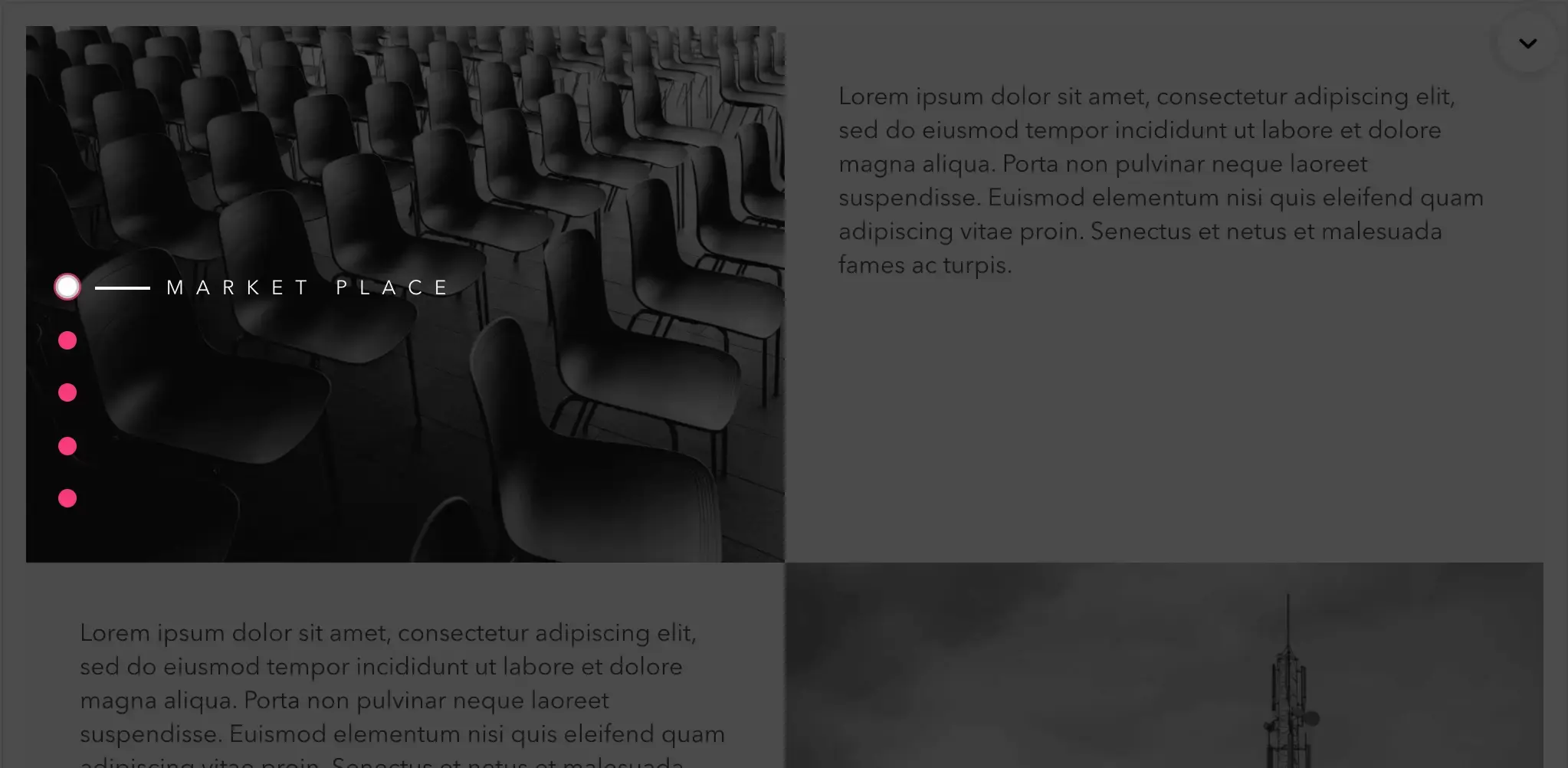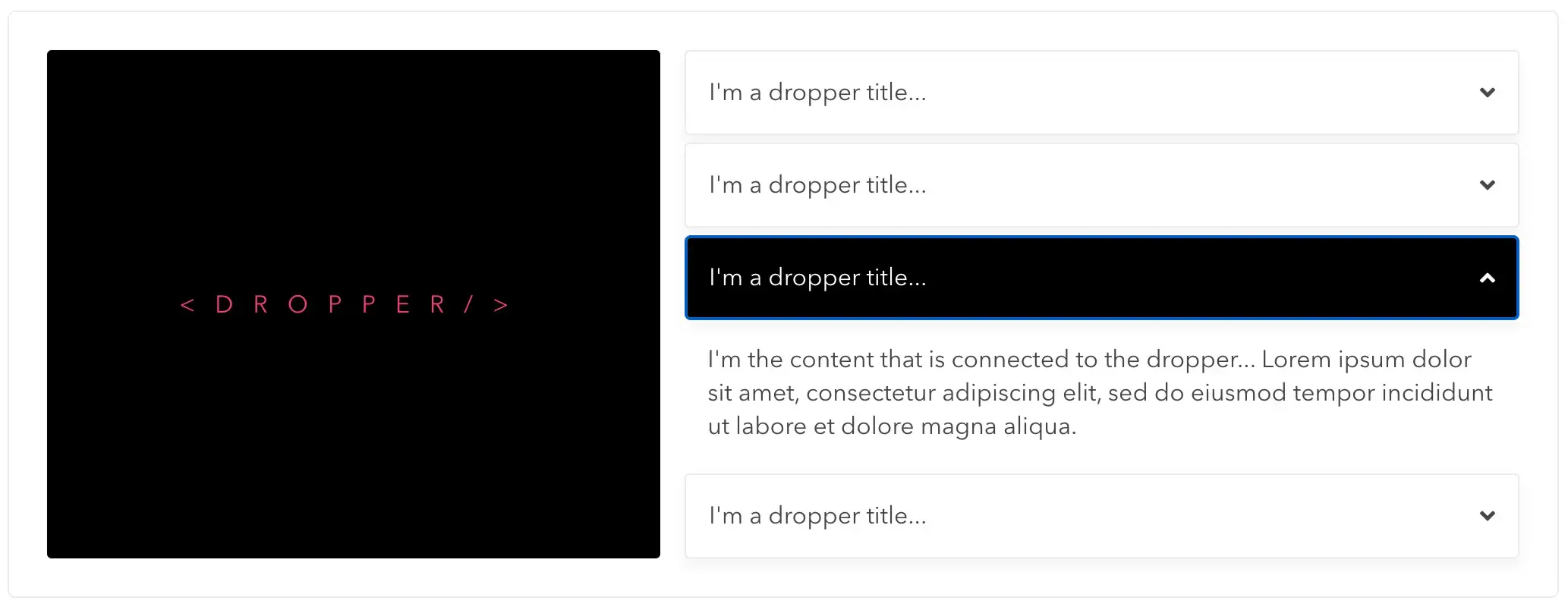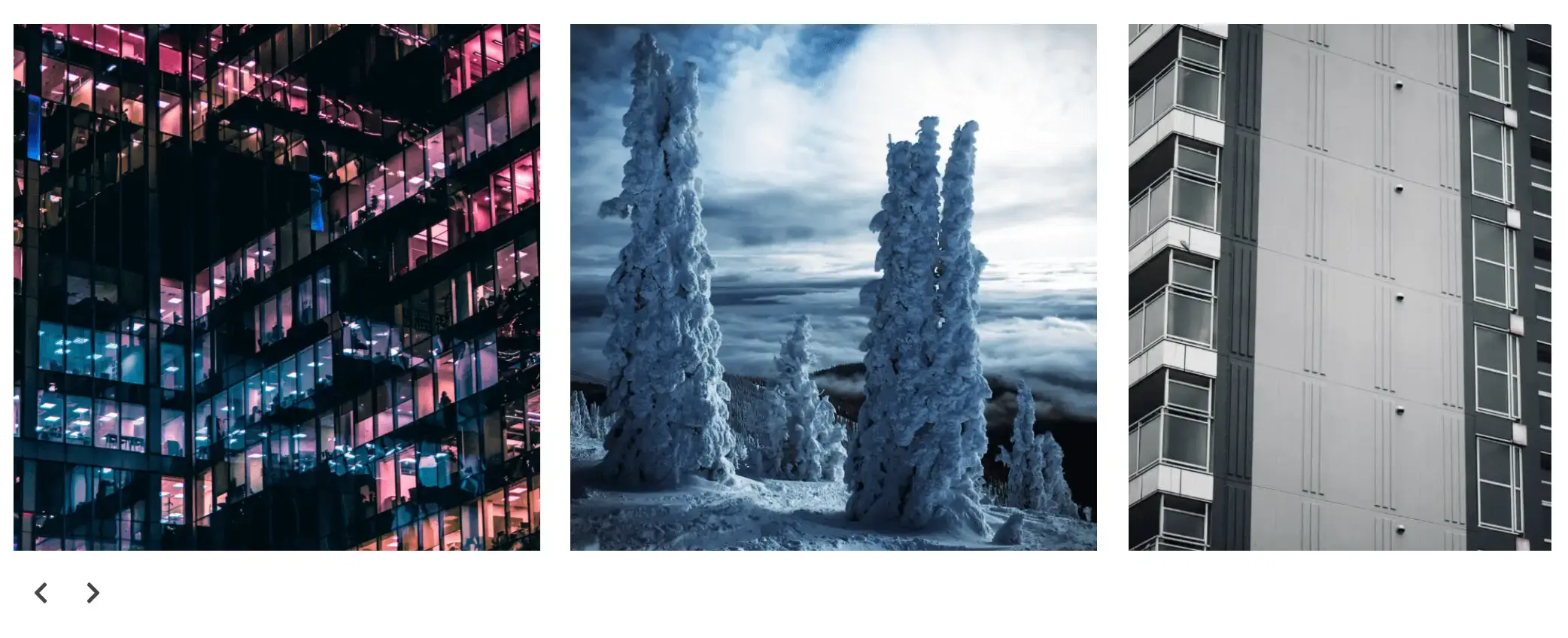
Welcome to ER Components! Please use the navigation to preview and try out these components I built from the ground up with React.js.
Actually, everything on the site was designed and built by me from the ground up with the exception of the Container and form components used from Mui.
The purpose of this project is to show my skills as a Front End UI Developer, and also to show the process of building and design UI/UX components from the ground up.
Technologies used are React, Typescript, Redux, Jest, React Transition Group, Css Modules, Sass, deployed to Netlify, and of course Javascript since React is all Javascript.
Data is all custom data I created off in the data.js section of the app to be able to pull into components via imports and where images are imported and handled by webpack.
Currently a work in progress as I continue to build out the project with more components and features. Really built for portfolio demonstration purposes only. The current customizable components are HappyDots, Banner, HoverPods, TeamBuilding, Dropper, EasySlider, Dashboard
ER